Philosophy of Art
I wish to communicate how I see the world and how I am as a person and artist. I want to show people the colorful details of things in everyday life. My goal is for others to view me as an artist who pays attention to detail, and hidden colors. I want them to see me as someone who makes dreams,myths,memories and imagination into something tangible. Bright colors and vacation-like landscapes inspire many of my artistic expressions. Incorporating meaning and detail into my paintings are important to me depending on what my subject matter is. Sometimes art doesn't have to have a specific meaning, it can just be something to enjoy to look at, but I do put emotion in my work every time. I want my art to make people feel something, whether it be what I intended or not. "Good" artwork to me is when the artist is creative with how they express the subject matter, and that can include angles, colors, or shapes. How an artist's work makes you feel or what they make you see can be defined as "good" artwork.
I wish to communicate how I see the world and how I am as a person and artist. I want to show people the colorful details of things in everyday life. My goal is for others to view me as an artist who pays attention to detail, and hidden colors. I want them to see me as someone who makes dreams,myths,memories and imagination into something tangible. Bright colors and vacation-like landscapes inspire many of my artistic expressions. Incorporating meaning and detail into my paintings are important to me depending on what my subject matter is. Sometimes art doesn't have to have a specific meaning, it can just be something to enjoy to look at, but I do put emotion in my work every time. I want my art to make people feel something, whether it be what I intended or not. "Good" artwork to me is when the artist is creative with how they express the subject matter, and that can include angles, colors, or shapes. How an artist's work makes you feel or what they make you see can be defined as "good" artwork.
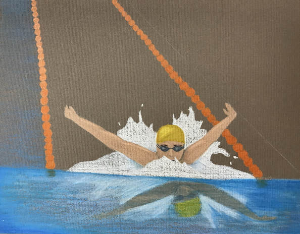
Reflection Project
My idea for this project was relatively easy to come up with, considering I pretty much know who I am and what I like. I had an easy time finding a topic to reflect who I think I am. I knew my idea wanted to include something with the water, because I love the beach and swimming. Planning really helped me figure out the shapes and colors of the water splashing. Deciding the angles and where my endpoints for the lane lines will be really helped my composition look realistic. At the beginning of this project a I didnt have much practice with colored pencil at all. Practicing blending and how to apply the right pressure really helped me understand how to use the softer kind of pencil. The practice was much needed, but it ended up paying off. I sketched the outline with white and flesh toned prismas to know where everything was. Section by section I shaded and blended a lot, layer by layer. I struggled with shading the lane lines a lot, considering its bright color and odd shape. The orange against the bright blue made each other pop and they work well together. I felt really successful in the overall color of the water and the highlights and shadows of the water. I think the more I practice and spend time blending, the more I can be successful. If I changed the composition to make the swimmer closer maybe it would’ve looked better, or tried a different angle.
Practicing with Oil Paint
Object Prjoect
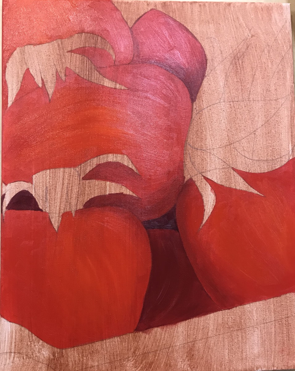
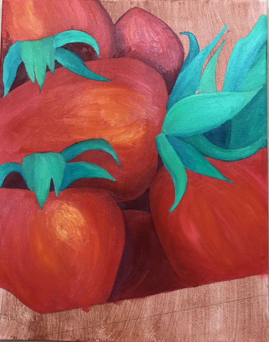
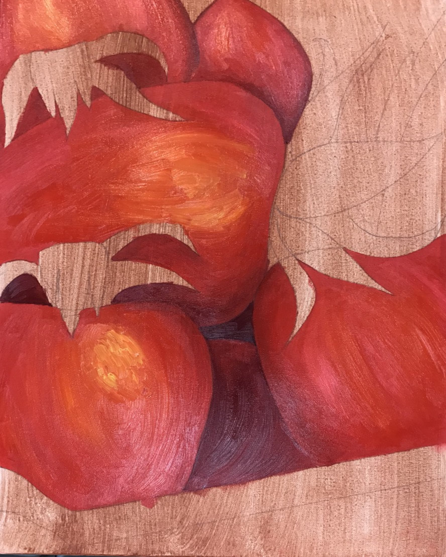
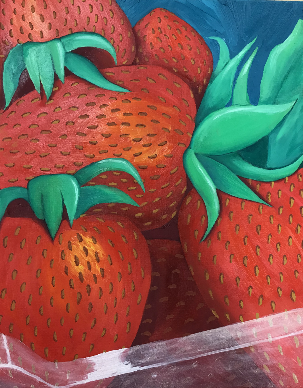
This project was to recreate an everyday object into something of our own. This started as a reference picture of a container of strawberries on my kitchen counter. In my head I could see all the unconventional colors i could use to liven the image up. I started with a picture and outlined major shapes to redraw.
Once I was ready to start painting, I put a wash on the canvas for a base, and drew the shapes. Using multiple shades of red, I started filling the berries in, layering color and texture. Choosing the reds was based on where the light was or wasn’t, and the smaller shadow details under the leaves and around the seeds really helped push things foward or back. I added some pink,orange, and yellow to the highlights and brighter areas to make the reds more interesting. I did the same with the leaves and which greens I chose to use. Every part of this piece has highlights and shadows in it, which makes the colors and picture itself more lively and picturesque. Lastly I put the seeds and the shading around them, making them look sunken into the berry. For the plastic container I had to use a lot of liquin to thin the white paint. It was a long and frustrating process, but the product is absolutely worth it. This piece is one of my favorites I’ve ever done and something I’m definitely proud of.
Once I was ready to start painting, I put a wash on the canvas for a base, and drew the shapes. Using multiple shades of red, I started filling the berries in, layering color and texture. Choosing the reds was based on where the light was or wasn’t, and the smaller shadow details under the leaves and around the seeds really helped push things foward or back. I added some pink,orange, and yellow to the highlights and brighter areas to make the reds more interesting. I did the same with the leaves and which greens I chose to use. Every part of this piece has highlights and shadows in it, which makes the colors and picture itself more lively and picturesque. Lastly I put the seeds and the shading around them, making them look sunken into the berry. For the plastic container I had to use a lot of liquin to thin the white paint. It was a long and frustrating process, but the product is absolutely worth it. This piece is one of my favorites I’ve ever done and something I’m definitely proud of.
Interior Spaces
This project wasn’t one of my favorites. Showing the inside of something is obviously harder than showing the exterior and what you always see. I went over so many ideas and it came down to the inside of a blender. I love fruit smoothies and I always put spinach in mine. I was introduced to water color pencils and decided to give them a try, hoping for a more precise line and even color.
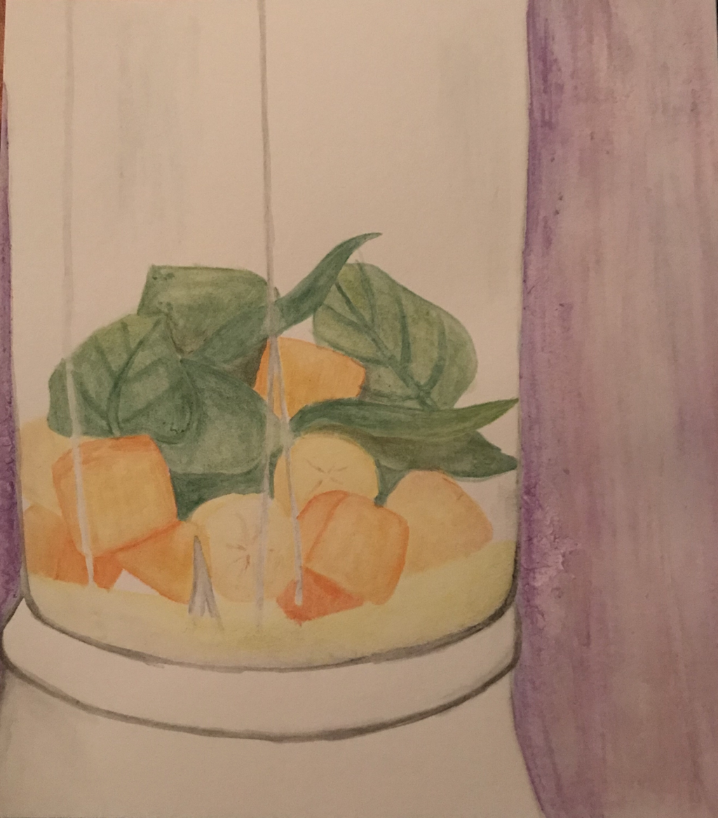
I started using a gray for the outline, since most of the blenders shape is that color. I really had trouble with the lines of the glass and getting them to be noticeable but opaque. The first part was mostly outlines and going over them with water. I really enjoyed using the pencils because I could draw normally, and then water them down, and go back over it.
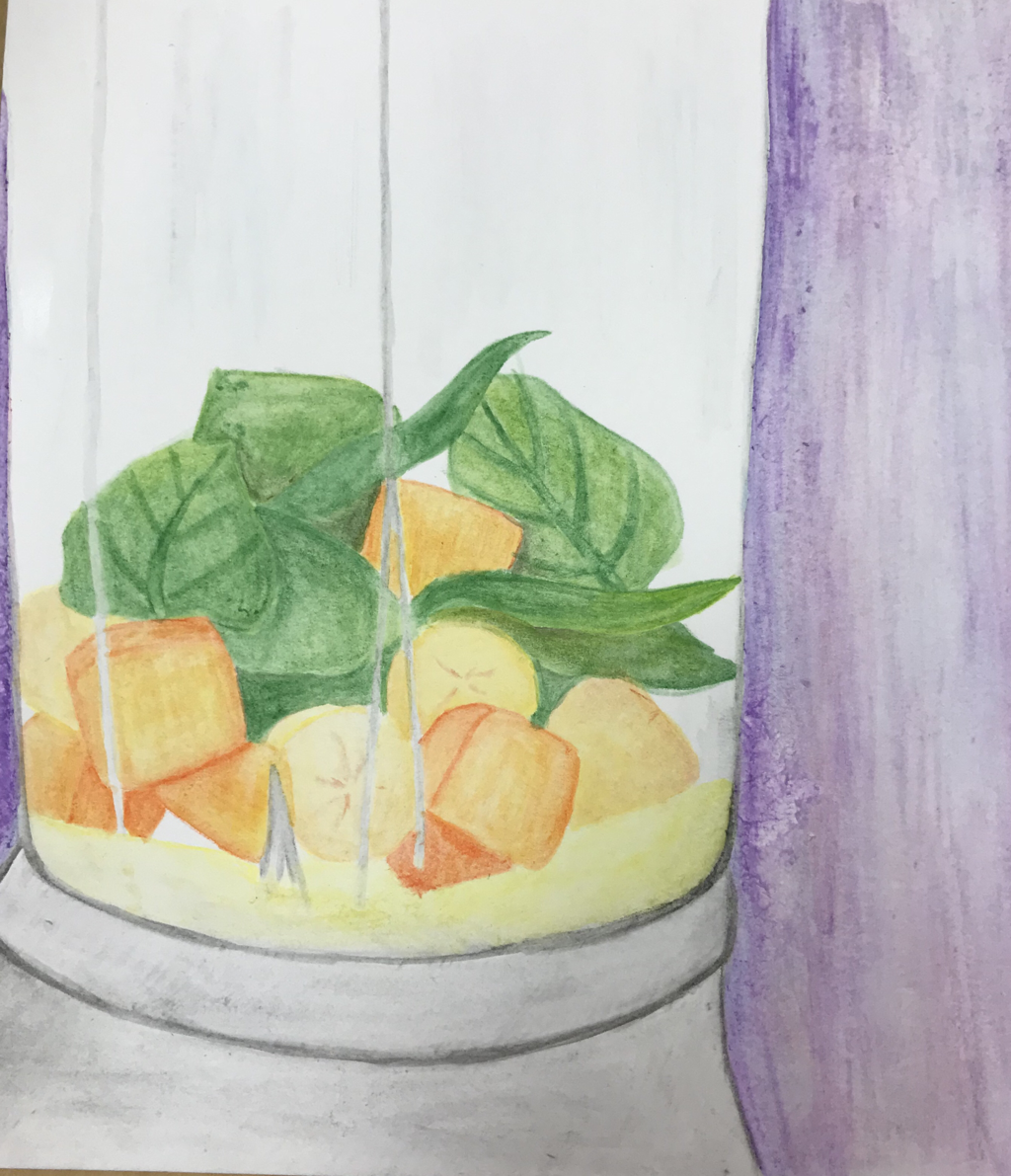
The mango chunks and spinach was my favorite part of this piece. Theres a variety of colors and more possibilities for details and angles. I liked the challenge of making the leaves look thrown in there and strewn about, and not posed. I found the glass itself difficult to pull off. Theres hints of blue and gray in the whiter space, but I dont think its too noticeable. I wasnt sure how to fix this without ruining the rest, so i made reflective lines as best as I could to show there’s glass and not boring white space. I’ve been trying to pick out the best parts of this piece, and focus on the good, rather than hate this project I’ve tried to figure out how to better myself, and if I were to try again how I’d go about it.
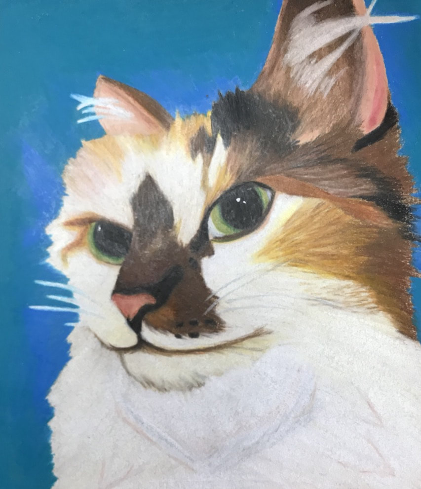
Animal Portrait
I drew my cat Ginger for this project. She’s a beautiful cat with lots of interesting colors, and her fur is very fluffy and textured, making it easier for me to draw textured fur. This was my second prismacolor project, so I was nervous that it wasnt going to turn out well. I think the picture I chose was very important for me to be successful. It was a clear picture and an interesting angle which captured her regal personality. I started with the outline in a light color. For me it’s easier to add darker colors on top of lighter prismacolors. I focused on the center and worked my way outward because the eye angle was a challenge I wanted to tackle first.
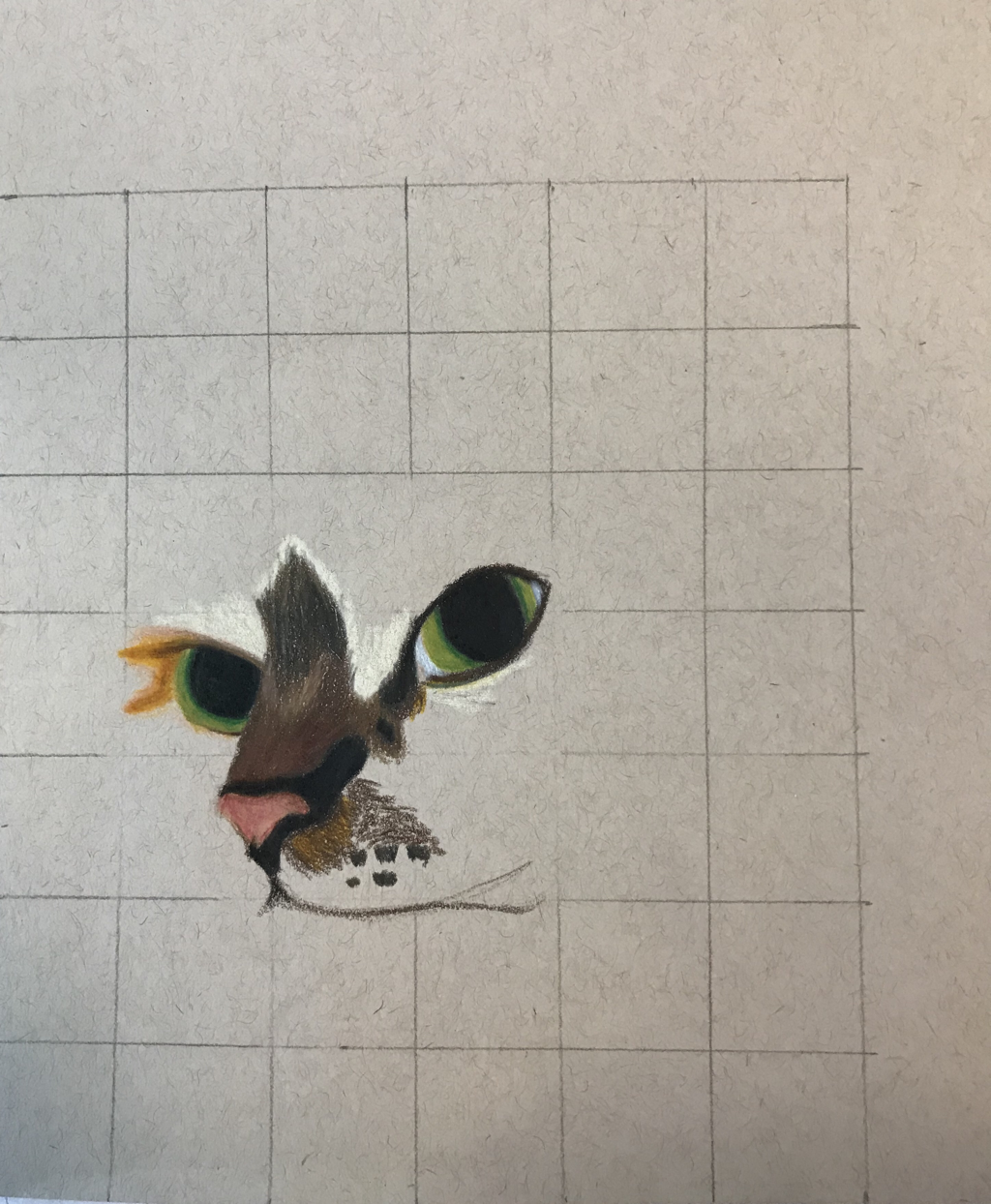
I kept going from the center outward trying to get the multiple colors blended together well. There was a lot of experimenting with blending oranges, yellows, and cream colors. Using a peach colored pencil helped me blend the fur colors and add some depth to the white fur. I just had to keep layering until it looked like my picture.
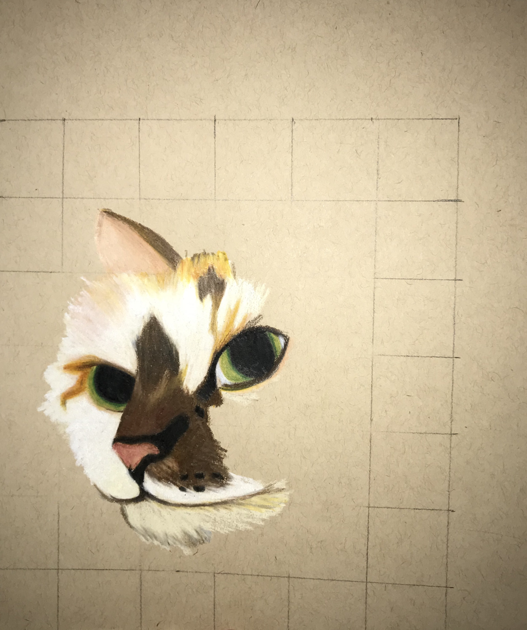
She’s got lots of wispy little hairs in her ears, which for me was another challenge. I wanted to show that they were there, but I wanted to keep the soft look of the hairs. I think I could’ve tried to make them look more fine and hair like by seperating them more instead of a few lines. But I think under my time constraint and what I’ve already drawn I could make it work.
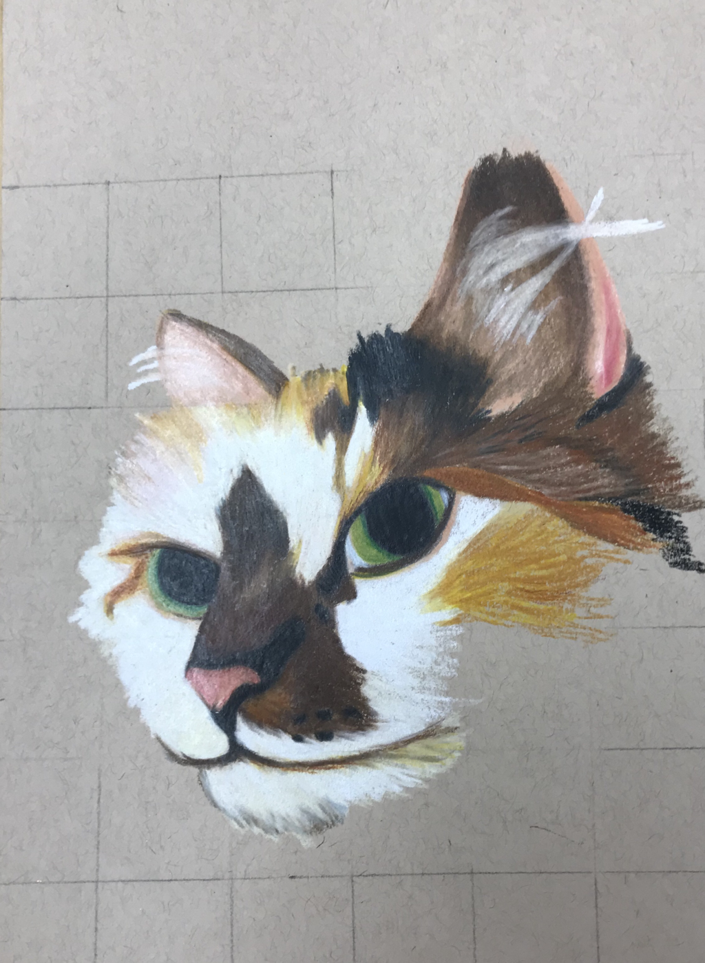
I mixed lots of unexpected colors within my pencil layers to get these specific colors. Animals can be tough because the color isn’t always given to you in a pencil, but I think it made this piece something to be proud of. I worked really hard at making the colors look like you could reach out and touch her fur. Since there’s a lot of warm colors in her fur I wanted a contrasting color for the background. I blended blue and turquoise to push Ginger foward and make her eyes complement the background. Doing so makes her eyes pop evenmore. I feel like your focus is on the center of her face. The angle and the darker colors in her nose really helps that happen.
Self Portrait
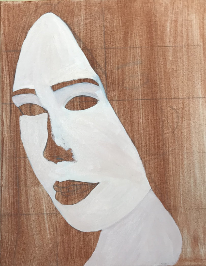
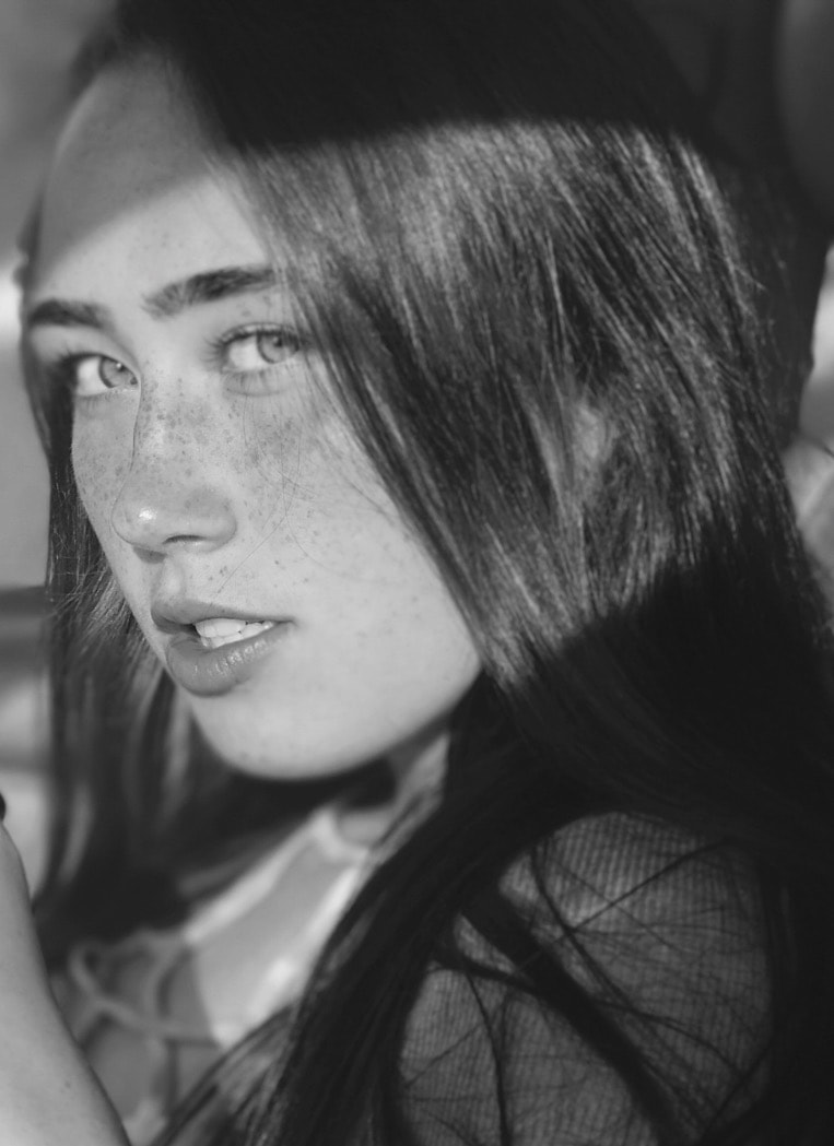
For this project I decided to do oil paints to achieve a smooth skin look. I thought it would be easy to mix up the colors and blend them all together quickly. I learned that getting the right tones for shadows and highlights are really difficult if you havent done a portrait before. I also learned that it could be harder to make a black and white picture to color . I started with the fleshtone thinking it would be good for a base and it turned out to be way too light, so I mixed in burnt sienna and blue to make it more cool and tan.
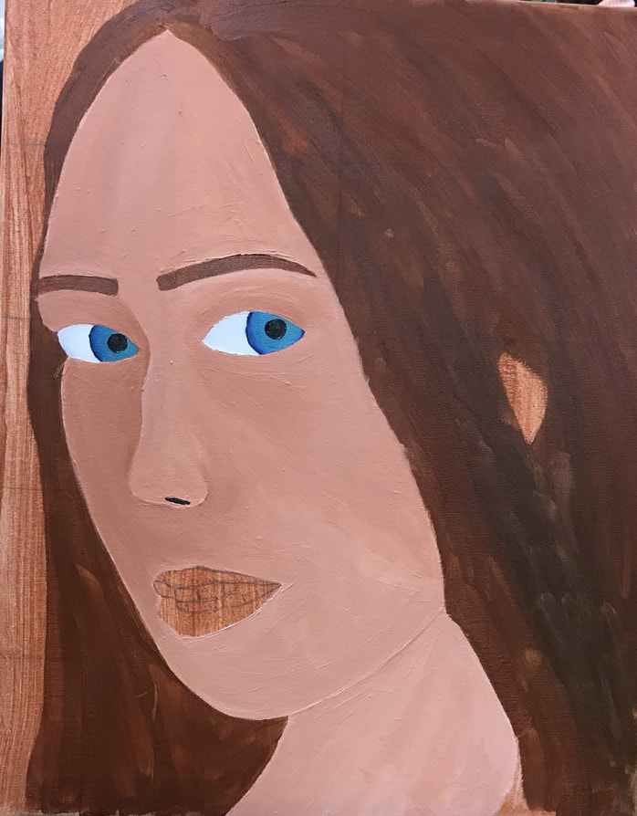
In this stage of my painting I thought I had enough shadows around the eyes and on the left part of my face, but I was pushed to do more. I think it ended up paying off because compared to what I have now and my original photo, this isnt enough. I mixed some more burnt sienna and dark blue to make the brown for the base hair color.
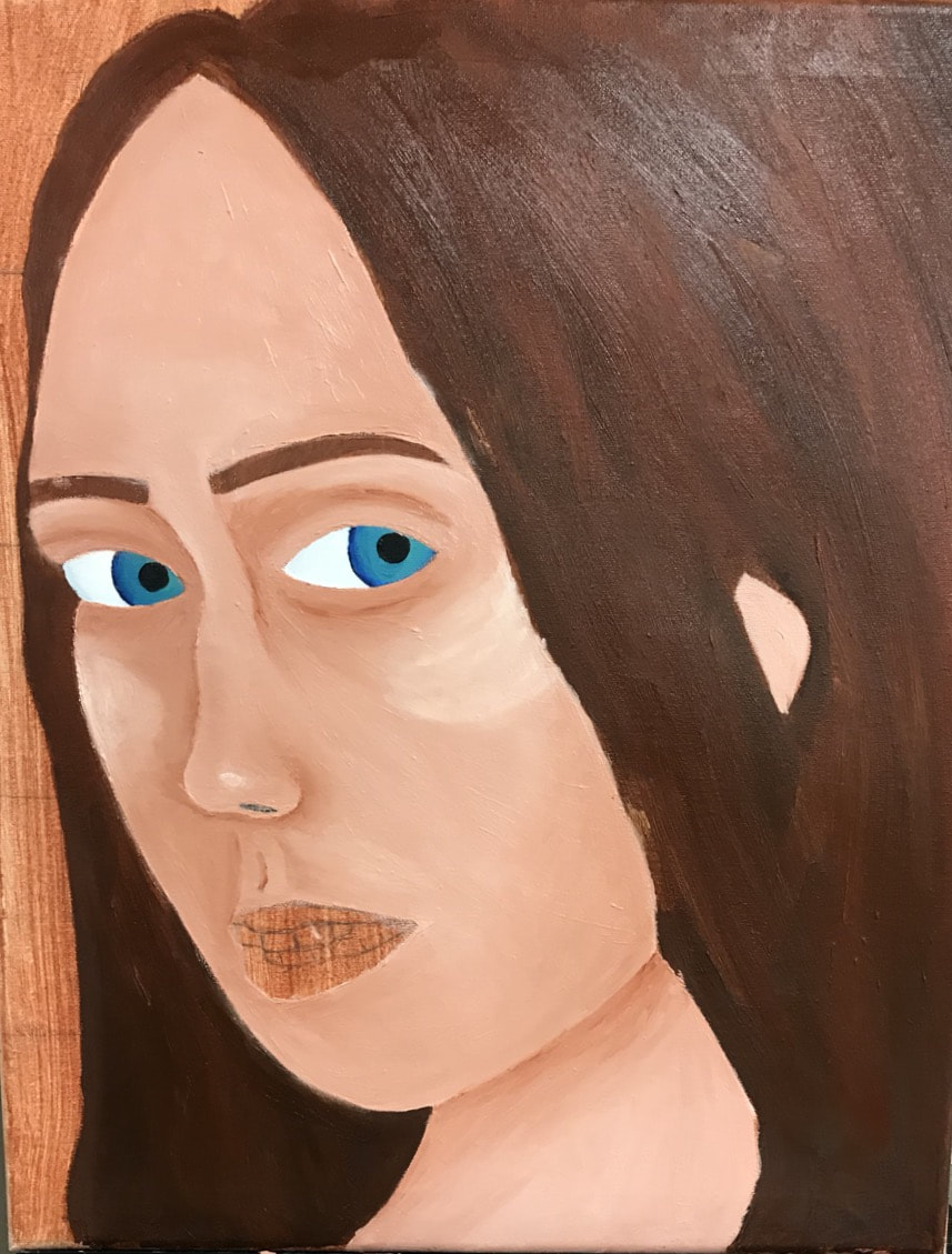
At this point of the project I painted over the face completely with a new skin tone. The paint dried and I wanted to come back and blend more and add more shadows and highlights. Changing the skin tone really helped things come foward and brighten things up. This picture was taken in summer, so at first I was thinking of how tan I was, and not how glowy I looked. With some help I pushed myself and added shadows and highlights where I originally thought didnt belong. Along with the skin I refreshed the hair color and added the iris colors. I think making the blue multiple shades makes them pop more and draws the viewers eyes to it.
I kept adding highlights especially on the cheeks to bring my cheeks foward more. The whites of my eyes needed shadows too before I went back and added more to the eyelids, which really adds some depth to them. When I fixed the eyelids some color got onto the irises and I decided the color should change. I actually really like how they look now because the stand out even more with the brighter colors. This is my first time attempting lashes at this perspective, and not one where they come off the eye from a profile angle. I think as of right now they look kind of spidery, so I waited for them to dry to come back and thin them out.
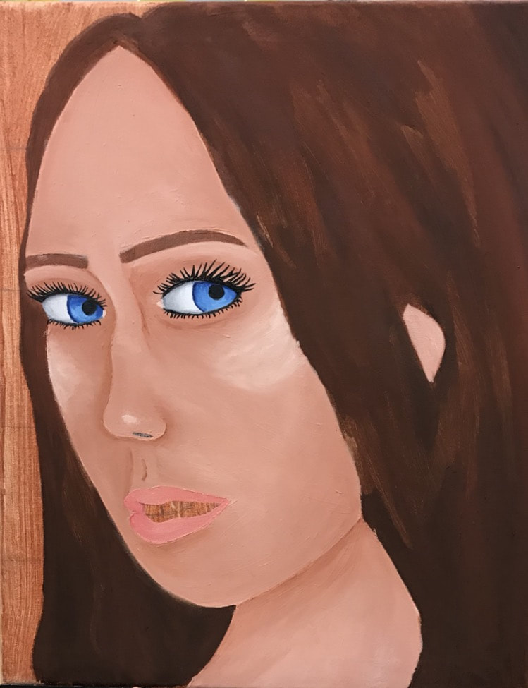
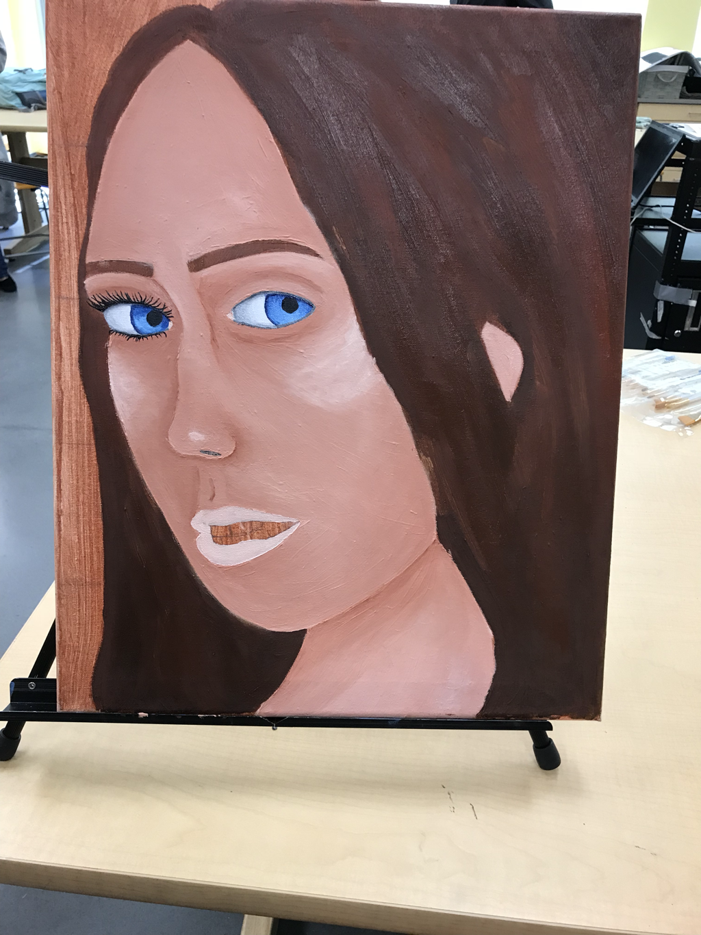
This project has been so much out of my comfort zone that I’m falling behind in getting it done, which can be frustrating. I was afraid of messing up a picture of me from the start and thats what I’m afraid is happening. I’m proud of my progress and I’m happy I’ve learned, but I just want to throw this one out. It’s not something I’m proud of as a whole, but a challenge I’m glad I took on. The lips have been painted, and when dry, more texture and detail will be added. More shadows have been added under my lips and down my chin also.
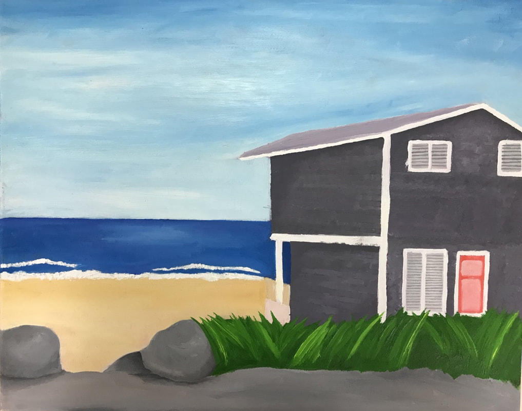
Landscape
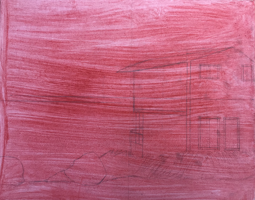
This picture was taken in Oregon, one of my mom’s favorite places right next to the beach. I had trouble getting the angle of the house right when drawing the outline. I had to find a single point off the canvas to make the angles of the roof correct. Once I got that right it was easy for me to fill in the rest and start painting.
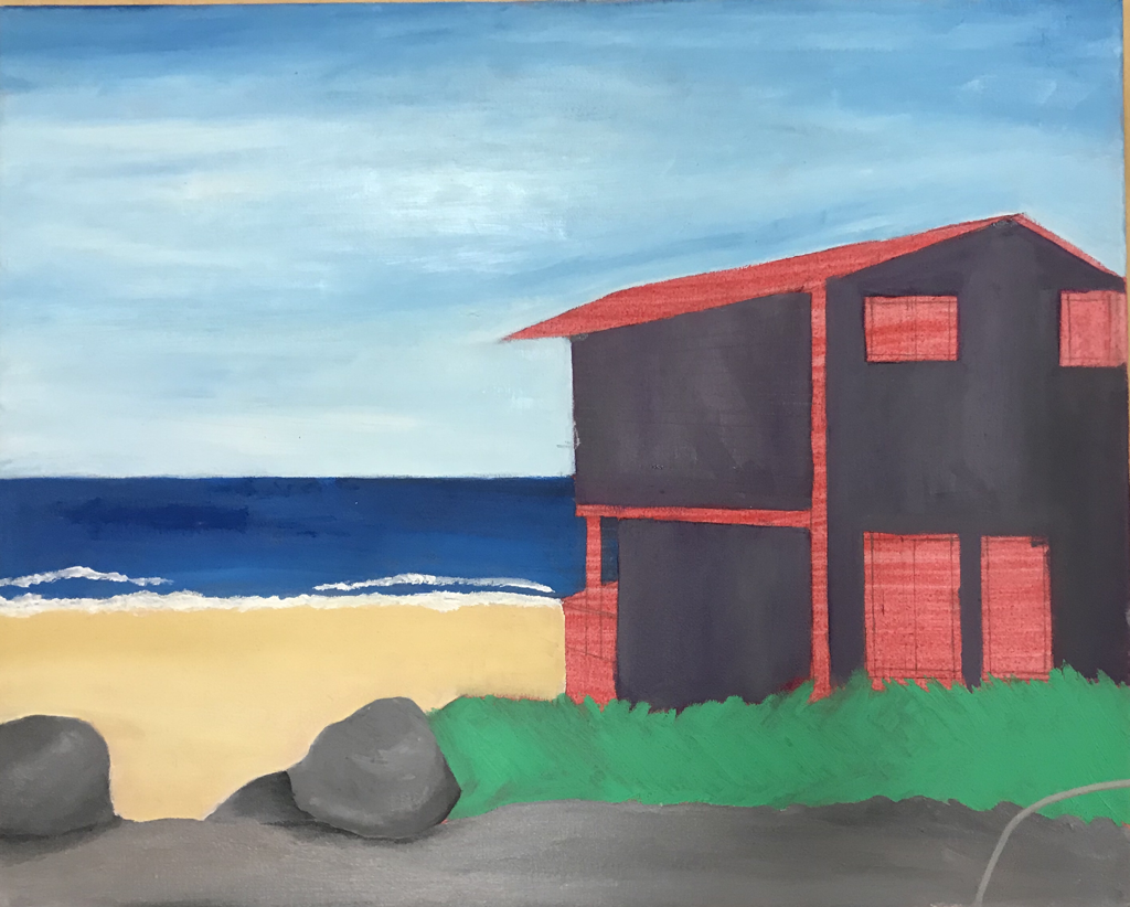
I started with very basic colors for the sand, ground, and sky. Since it was oil I needed to get a base down and fast because I was running behind everyone else. A while later I blended in white and darker blue to imitate wispy clouds and put in darker sky values. The house was a little tricky because I didnt want to do a simple grey, and mixing in just the right amount of purple in was a challenge. It payed off though because I think the color has depth and attracts the eye, but its not in your face.
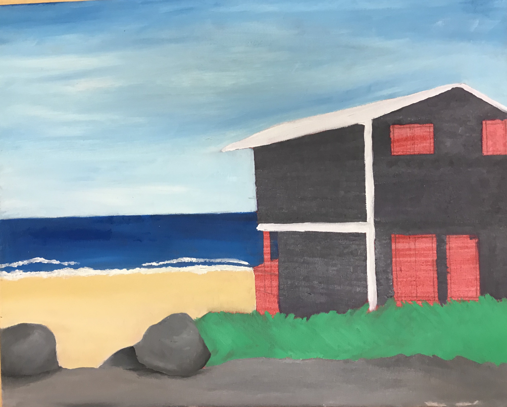
The rocks were fun to do because of the values. I could easily see the shadows and highlights in the picture, which made it easy to imitate on the canvas
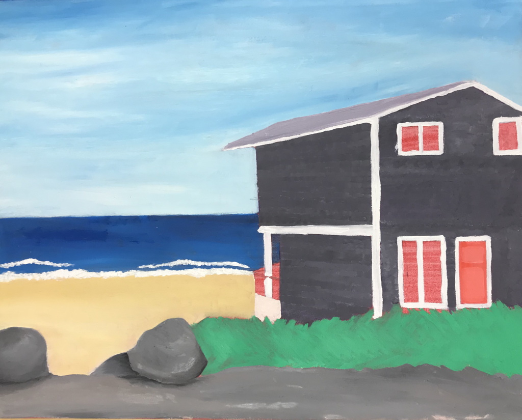
I painted the roof a light gray-purple to compliment the house color. The windows in the picture looked very boring and just had a white curtain in them. I changed it and made blinds to add a little something to the picture as a whole. I had to go in with a small brush and lightly make the lines for the blinds, but I made it work somehow.
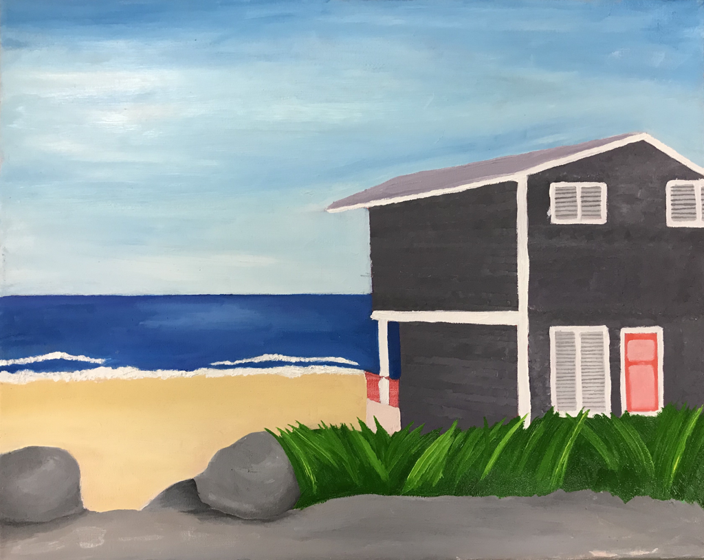
For me, the grass is the most interesting part. There were lots of shadows and highlights to add, and i think it really draws the veiwers eyes away from the sky. I went darker after the medium color I added because it’s easier to add highlights. I mixed in some yellow into the green instead of white and green for the highlights, and I think that made it more realistic.
Nature Turns Mechanical
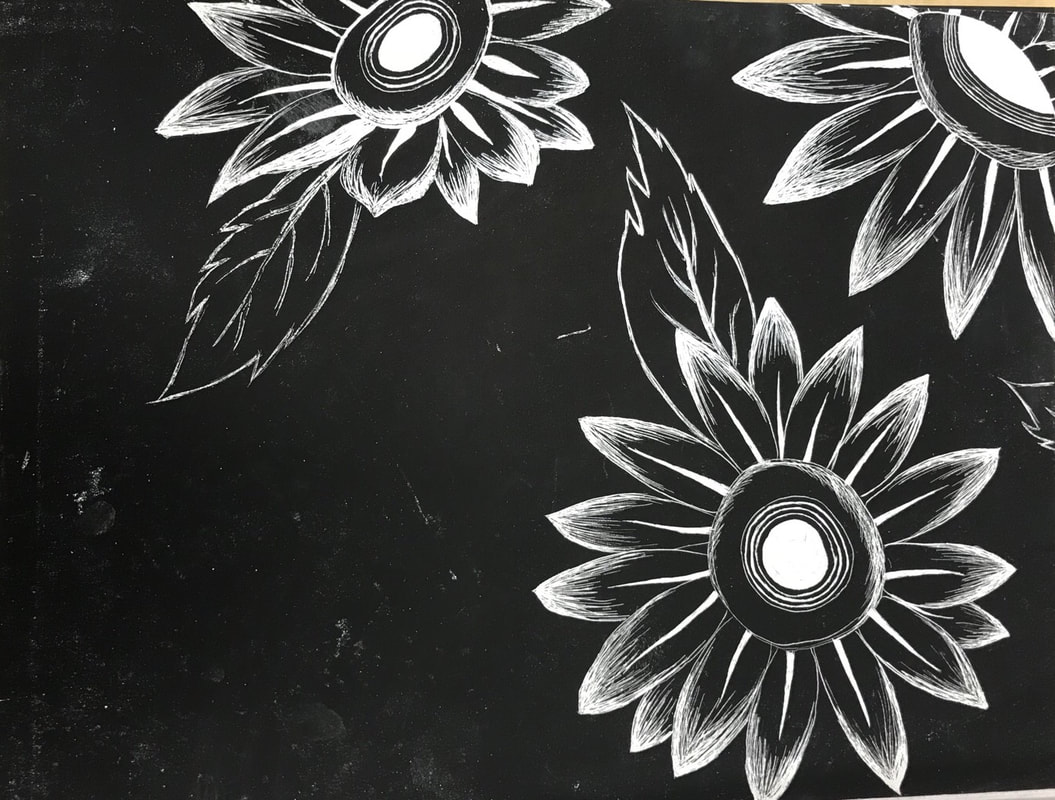
For this project I had the idea to make a piece having to do with technology and how it seems like someone’s always watching. I turned the middle of the sunflowers into camera lenses, as if you cant even enjoy nature without someone taking a picture for social media, or how someone could be watching you through cameras you don't know about . For the background I was a little lost until I thought of spies and being on the grid. That sort of pattern seemed to fit my theme
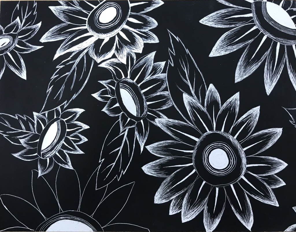
I chose to do scratch board for this piece because I thought it would be really interesting to try. I saw others using it and I liked how you could get textures to easily show more compared to prismacolors or acrylic paint. I started by trying to trace the circles for the middle, but for me it was harder to do so rather than freehand it. Using a picture of a camera lens I tried to capture the small lines and details, but doing some things with scratch board were harder than I thought. Making perfect circles even with a stencil can be hard with how you move the xacto knife, and how hard you push. One of the things I learned from this project is control and how to angle your wrists and hands to make it work.
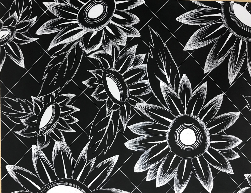
I think I could've taken this idea and added more to this piece. I could've done more flowers or added stems and not just leaves, but I'm also really happy with how this turned out. I feel like if someone were picturing this in their head it would be floating flowers and a green background and the lenses would be flashing. I think maybe if I used a different medium I could've made that happen and brought my vision to life more. Once I did the circles I moved on and started the outlines of the petals. I wanted to trace them and make them all the same shape but I thought it would be better to make them irregular like nature is, and let the grid lines be spot on for a balance between organic and inorganic shapes.
The last parts to this project were putting the details into the petals. I only had the outsides done at first, but it was pointed out to me that it would look better if the inside going around the center had some detail in it too. I really liked how it looked and went with it. The leaves were pretty quick to do because I had the idea of how they looked in my head and could easily free hand it. Lastly, the grid lines for a finishing touch. At the start of this project I wasn't really sure what to put for the background or if I should've added more flowers, but I'm glad I went with what I did and I think it really makes the flowers come forward and pulls together the composition.
Reflection
Over this past semester I've learned a lot to improve my work, style, and time management. The pace was slow at first with the first few projects, and increasingly sped up as I worked on bigger and more complex pieces. As that happened I saw myself falling behind, and struggling to keep up with others who were faster at working, or had more time to work on their projects. I think from that experience I learned how to get more done within a small amount of time, whether it be finishing another piece while the other is drying, or starting other sketches while I wait for layers to dry for 10 mins. I also learned to keep ideas flowing in my head for future projects while I work on the current ones, and maybe stop here and there to sketch or write the ideas down to not lose them. Eventually I learned how I worked and made pieces accordingly, or brought my work home. The work I've done this semester has also helped me learn about new mediums. I didn't know that there was such a thing as watercolor pencils or scratch board. I got to try new things and figure out what works for me and my style. Looking at other people's work and seeing what they use and how they use it has been very eye opening too, because some people have techniques I didn't even think of. One person at my table infuses essential oils into their paint to make it smell a little better while working, and to add to the piece itself and give not just your eye something to look at, but your nose to smell a scent that could help you place yourself in that setting. Another person uses pallet knives for bigger things to speed things up and cover a bigger space more efficiently. Seeing how other people experience life and how they see things and express that in their artwork has helped me in how to put whats all in my head into something others can see. Being in a classroom setting has helped me a lot by giving me others to inspire and push myself to my benefit. Having others around can keep me from getting too distracted and keeps me talking and engaged while working on a more boring part of a piece (planning, base layers, etc) This semester has also given me the chance to find and confirm my style. I've been told and noticed that I'm attracted to bright colors and vibrant and interesting pieces. If I work big then it's close up to show detail, almost if I was working on a smaller canvas. I realized I gravitate towards more upbeat ideas and compositions. I think that's always been how I work, but now it's been confirmed by multiple people and it's all been very reassuring that I'm going down the right path. When I paint or draw its all about what attracts my eye, and how I can replicate it but in a way that makes it look even cooler. Working on different ideas and subjects has made me expand my horizon while staying within that box I can put my type of artwork in. I think I've really grown in how I start a piece and how to keep pushing for darker shadows and brighter highlights. That's a bad habit I have and it's not perfect but I think I'm getting better at doing so. Over all I feel really good about this semester, and if I've grown this much then I can't wait to see my work by the end of next semester.
