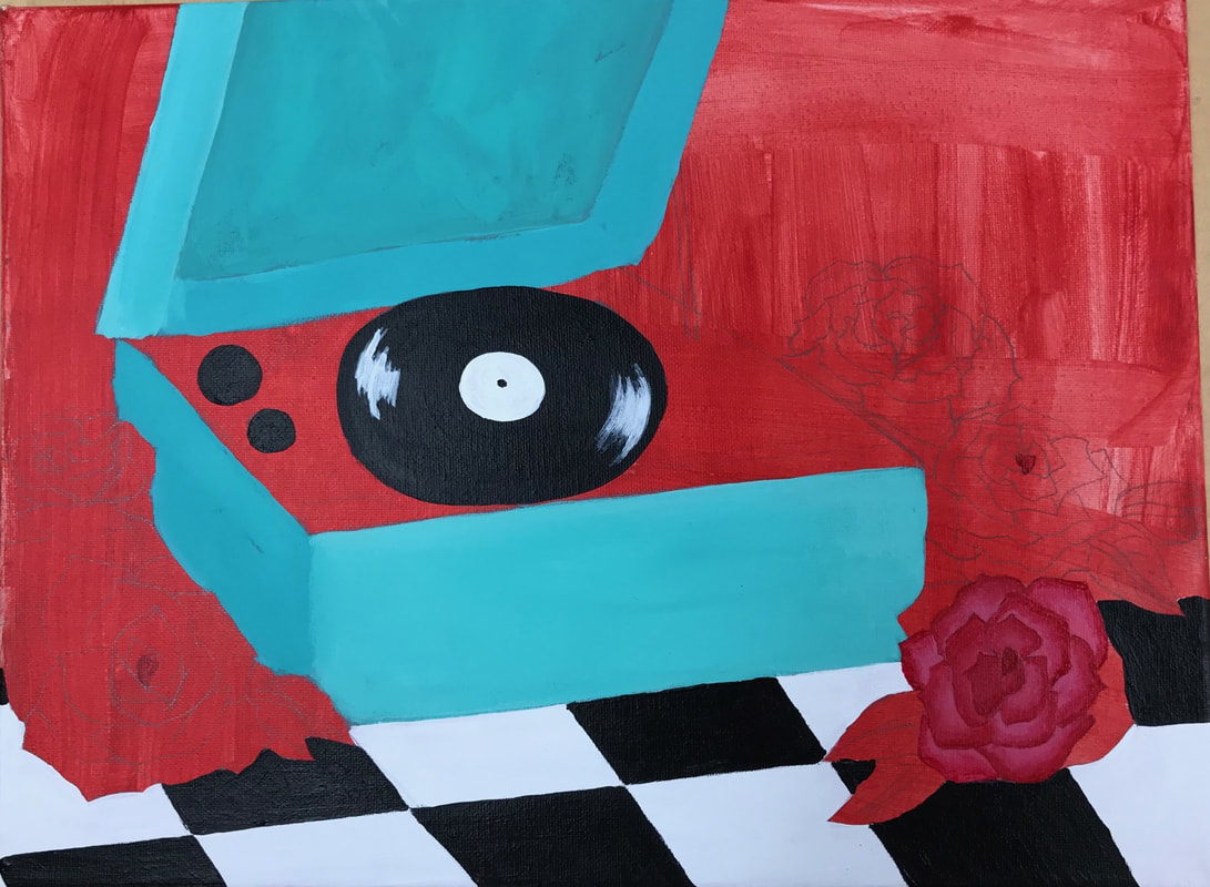
 For this piece I decided to go with a lot of classic designs. Roses are timeless flowers and I think the flowers themselves and the color really adds to record player. The record player is teal instead of wood to give it a revamped look. Everyone had wood ones decades ago, but teal is a more modern color and I wanted to make something new out of old memories and an older piece of technology. 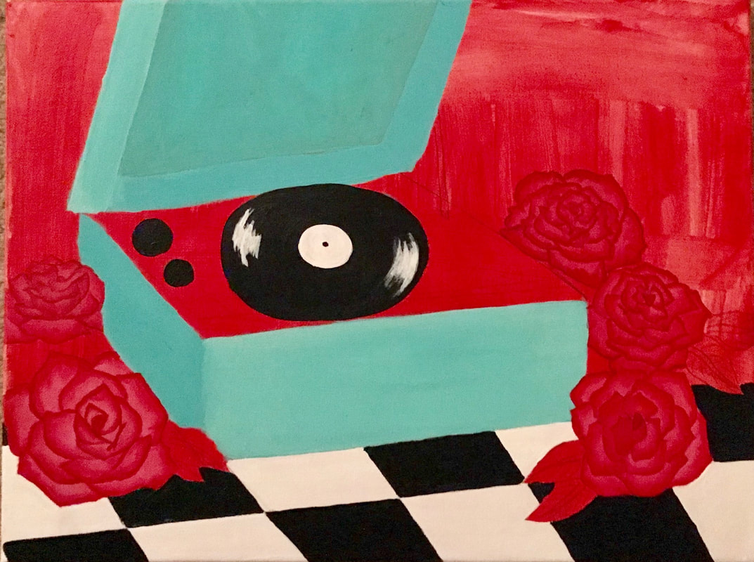 I had trouble getting the details of the roses and getting them just right with the shading and highlights. The shape and the details of the record player were a little tricky, but I just drew from the picture and made it work. The checkers were probably my favorite part of this piece because it provides balance between the organic shapes of the flowers. It really gives it the retro theme and makes everything come forward. 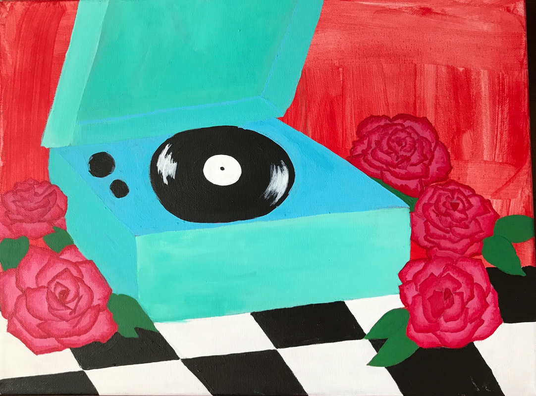 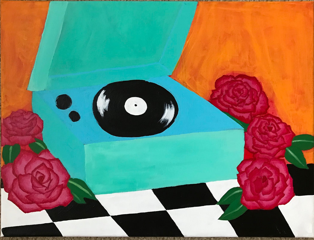 I added the orange background to make the blue come forward and warm the whole piece up. I wanted to make things look brighter and give that happy feeling you get from listening to music like swing, jazz, etc.
0 Comments
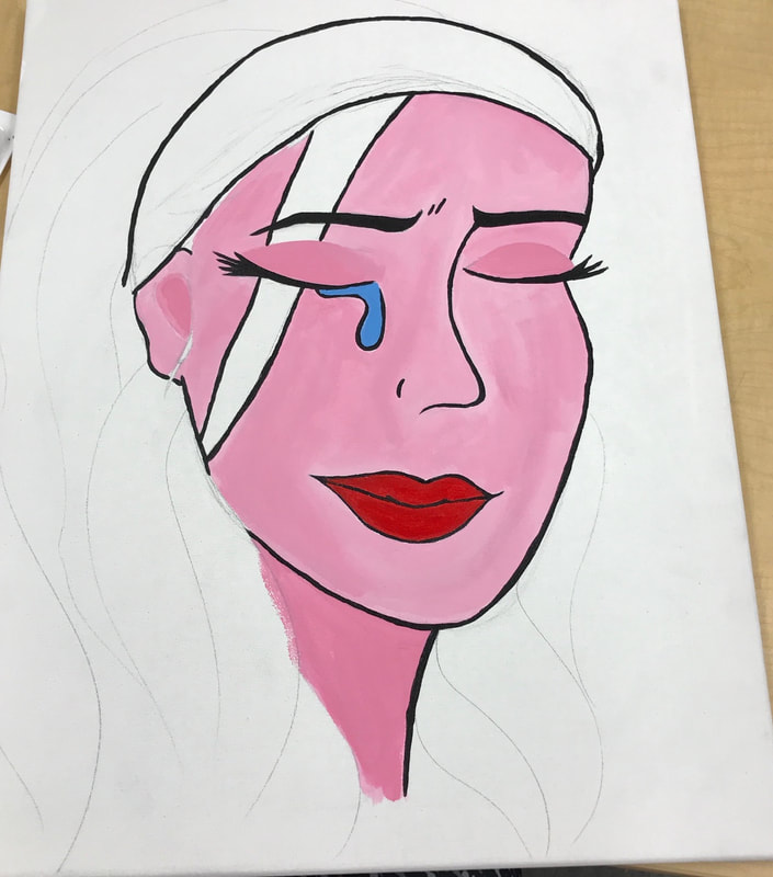 This piece is inspired by Roy Litchenstien's "Crying Girl" , so I decided to rename it since my work was inspired by his. It's similar enough that I thought it would be a fitting title. I started by using a picture from a classmate and sketching out the outline of her face. I took the picture at a specific angle so I wouldn't have to guess how to draw the face from a straight on angle. I painted the skin and outlines so I didn't lose the pencil marks. 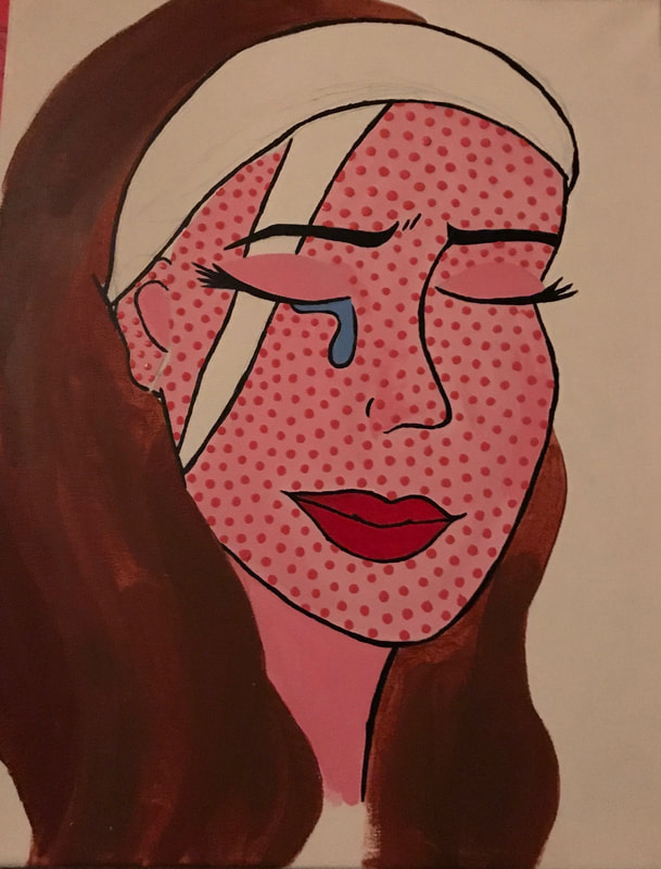 To stay with the comic book style I dotted her face and stuck with pinks, so the colors I chose were abnormal, but still realistic. I struggled with mixing the right brown. Burnt sienna wasn't the right color, so I mixed in some blues and whites trying to come up with a medium color. I'm glad I ended up with what I was hoping for, since I didn't want her to be blonde so I could have a yellow background. I chose my colors very carefully so they could all stand out on their own, but work together.  The headband and nose piercing was on my model when I took the picture. I thought it was good to incorporate this because it brings in the modern styles people wear today. I fixed the hair by continuing to layer paint and did the same with the headband. The purple of the headband, and the yellow background work together but also contrast each other. After all the base colors were finished I redid the outlines after color was painted over them. This was something I was very particular about. The lines really help it look like a comic book drawing so I made sure they were bold.  |
AP Slideshowhttps://docs.google.com/presentation/d/1BsKfc5t1K_w3Tdgd1P_6PtwBsPtxMjCXDZFuRFmWSpU/edit#slide=id.p Archives
May 2018
Categories |
 RSS Feed
