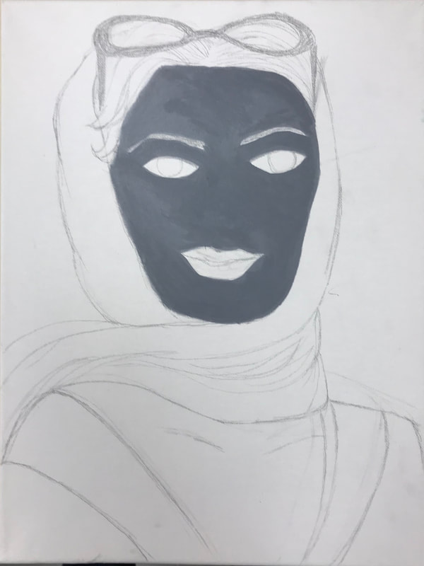
 I wanted this piece to look like an old picture, because while color tv and photos were around, black and white photos were still popular. I started by sketching on the canvas for the face outline and scarf. I forgot to put a wash but I think it ultimately helped me because color would make it difficult to focus on the greys I need to make for this. 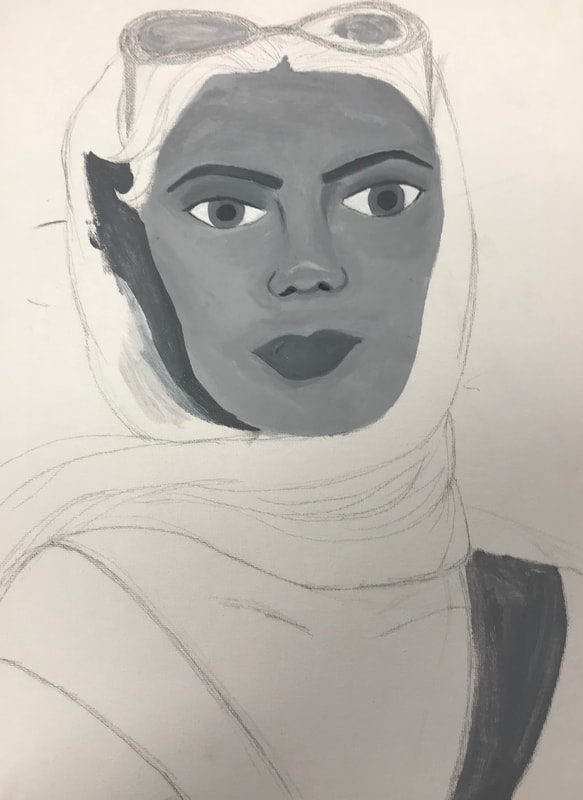 I started by sketching out the basic outlines of the face and scarf. I forgot to put a wash on the canvas first, but I think it helped considering I'm doing black and white and I don't want to cover up the color. At first the face color was way too dark. I had to basically start over and paint over all the skin I already did. I like how it looks now, but it was a bit of a set back. Mixing the colors was pretty difficult because I had to consistently get the correct shade every time I mixed more paint to finish the face. Everytime I mixed it too dark or had extra black on my brush I used it for around the face hoping to see how contrasted it'll end up being when I paint more. 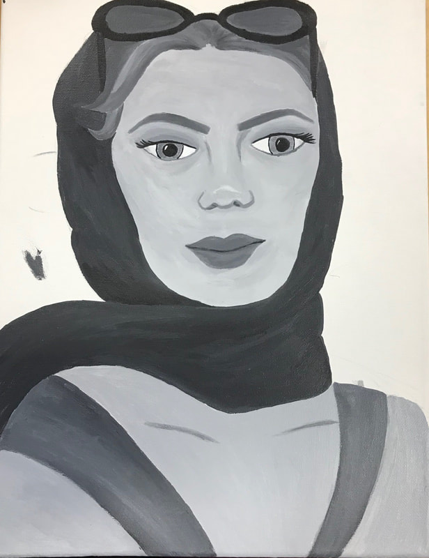 Once the skin was fixed, I worked on getting the shadows and filling in features of the face. I tried my best to get the shoulders and chest to match the face and I think it worked pretty well. I'm going to continue playing around with the shape of the lips and eyes to see if I can make them match a little more. The angle from my reference picture was difficult to work with but I made some changes and I think it worked pretty well. 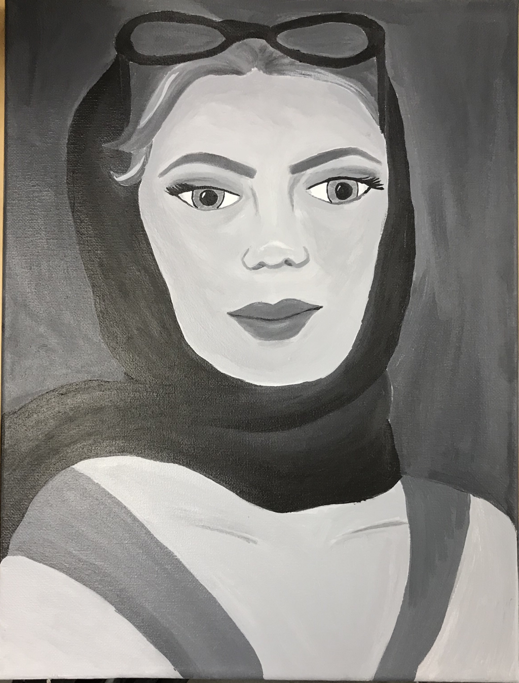
0 Comments
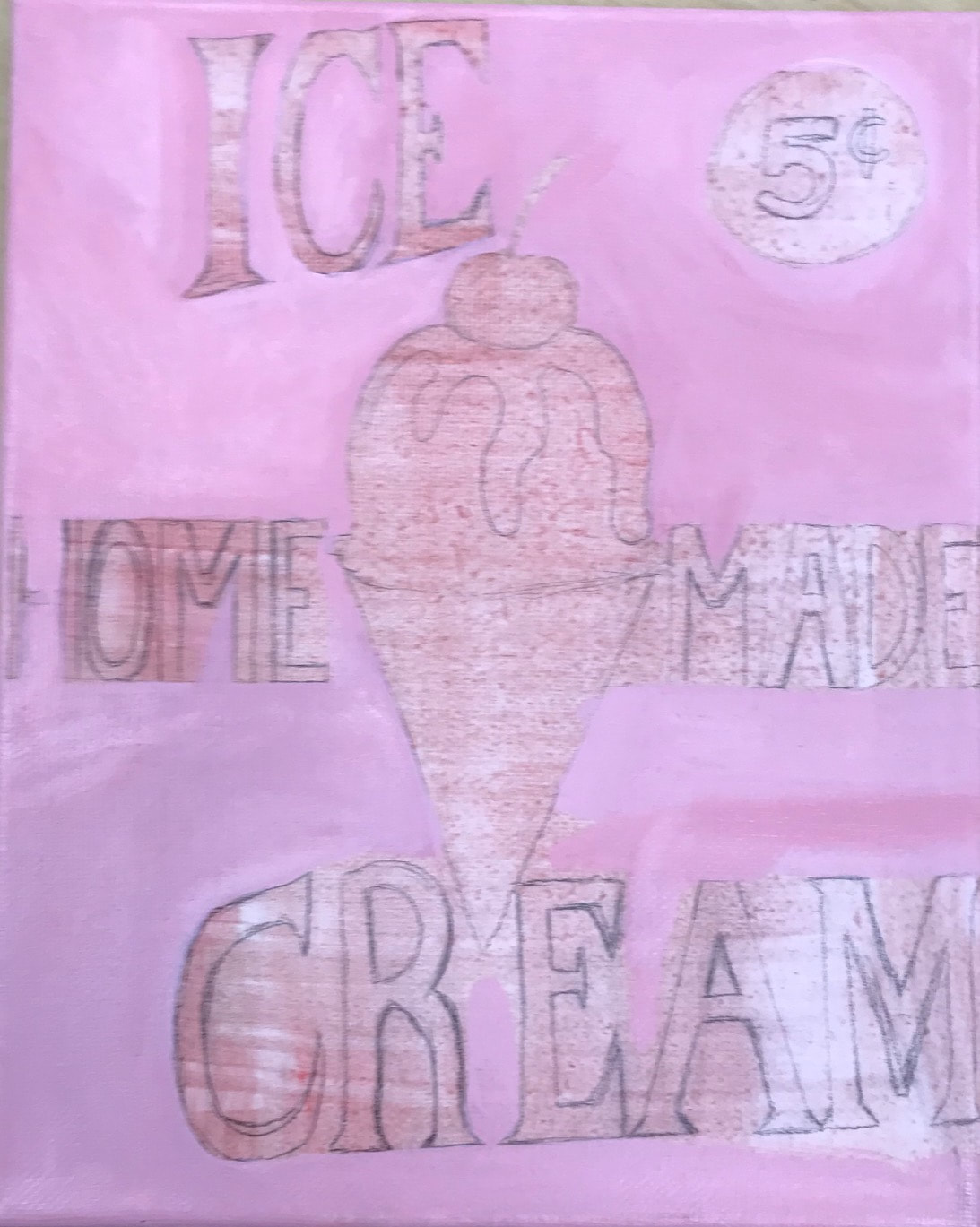 I wanted to do an old fashioned something for one of my pieces, and I thought what was and has been a popular sign? Ice cream immediately popped into my head when I thought of a family outing or something old fashioned. 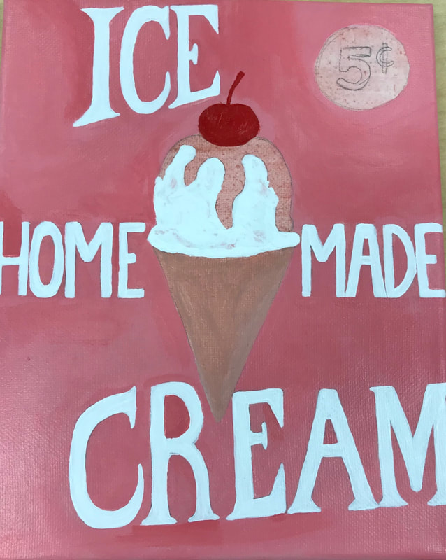 I started with a pink background and drew the letters to get an idea of where I wanted everything placed. The shapes of the letters were actually pretty hard because I had to get them all to be the same size. 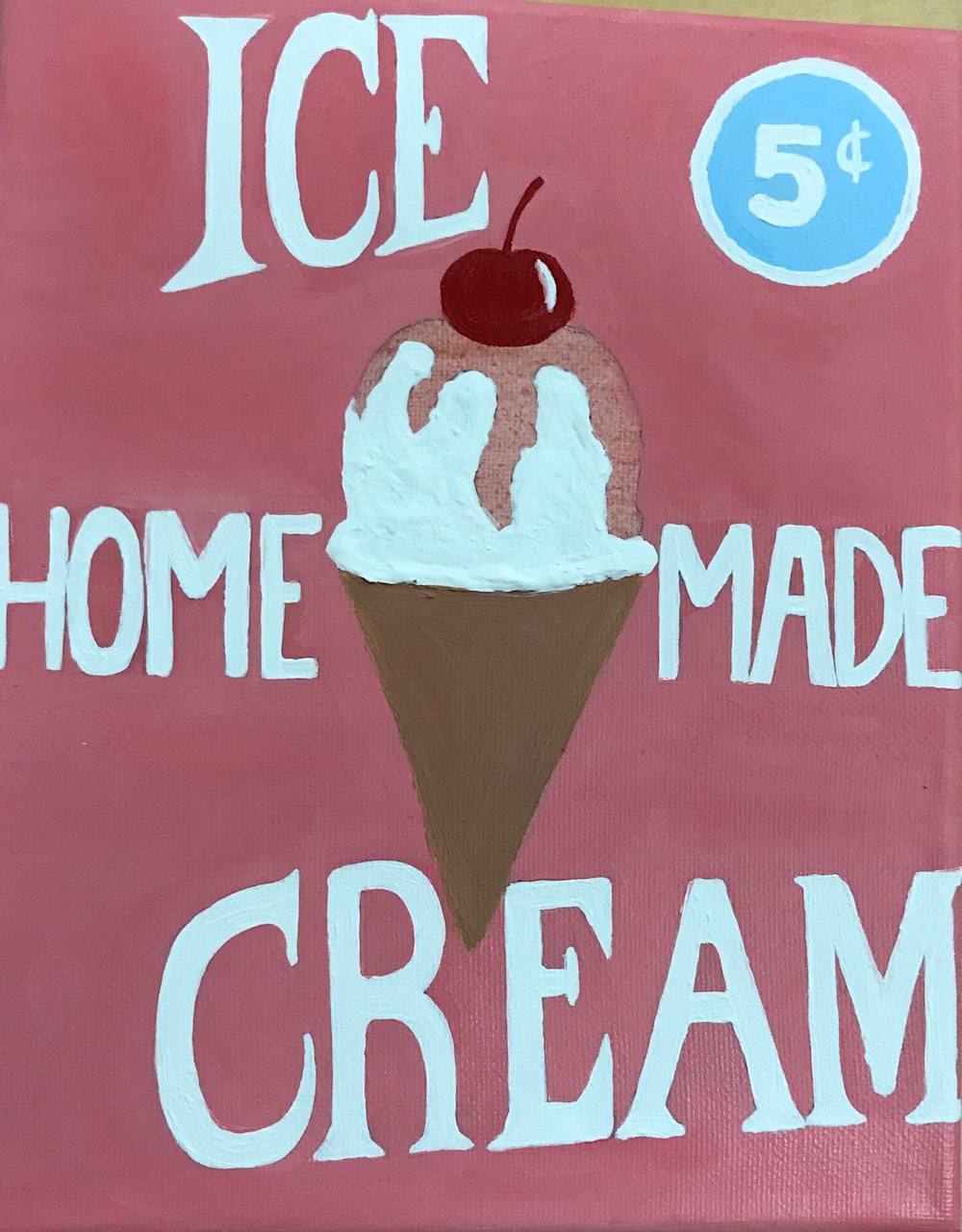 I added gesso on the part where the ice cream would be so there's some texture like if it was actually ice cream. I think it was really successful because it really does give it some realistic texture and it makes the painting interesting. I think it's almost easier than painting lighter and darker yellow whites to make shadows where the ice cream would be wrinkled. 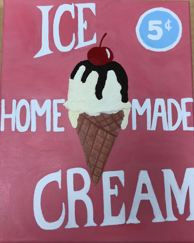 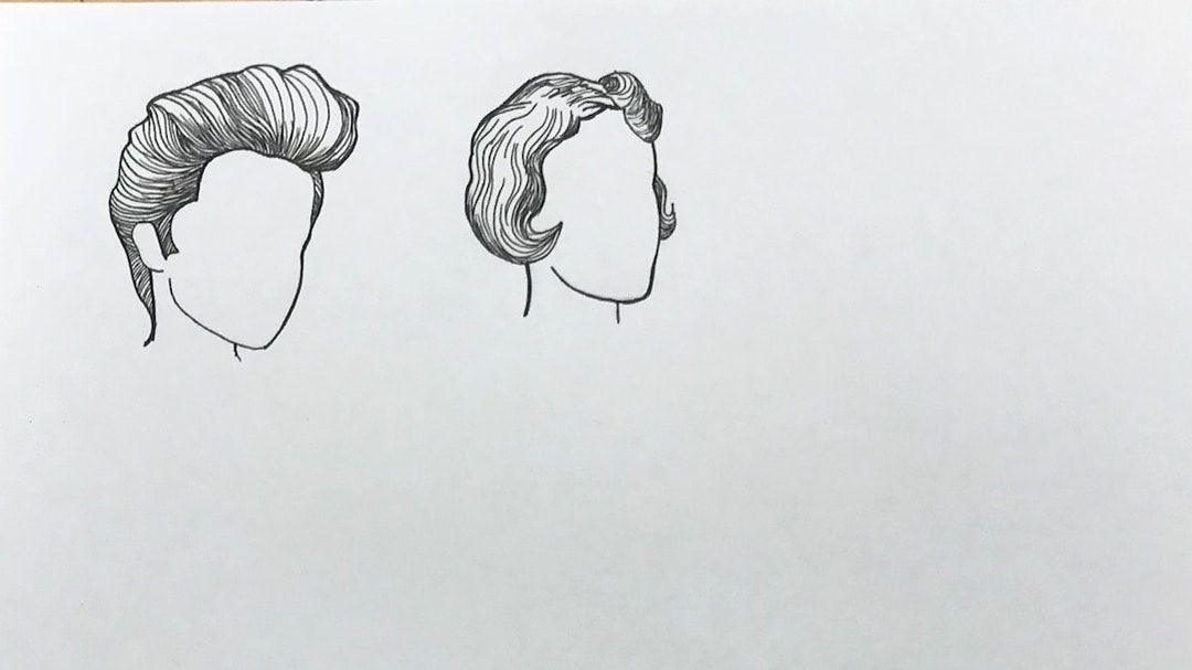 This piece is showing the hairstyles in this era. I wanted to leave the faces blank to emphasize the details in the hair. At first I wasn't thinking I'd add a background, but as I looked at it more I thought I should put something , but I wasn't sure what. I had some other people help me out and figured out what would compliment the outlines. 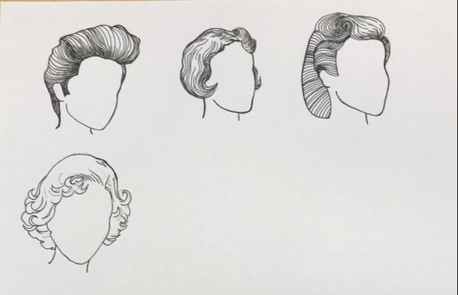 I started with outlining pictures to get the major shapes with pencil to get the placement I wanted. I then went over that with pen, and continued to add detail to show where its lighter and darker. I just tried going line by line because I can always add more pen, but it would be really hard to take it away. I wanted to take it slow and make every line intentional. 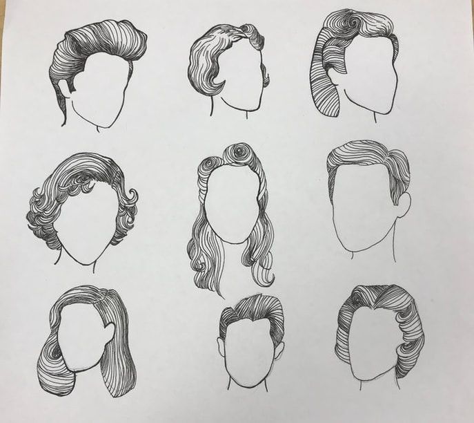 Every face I put down I wanted to match the others, but also make their faces different shapes and turned different ways. I think it makes the piece very interesting. 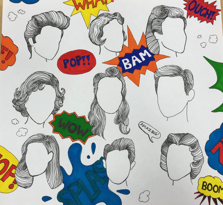 I decided I was going to add comic book blurbs to make everything come together. The back was looking too plain. I used prismacolor markers to get the bright colors and then outlined it in pen to make it more bold. The puffs started as thought bubbles but then I just decided to make them little clouds. 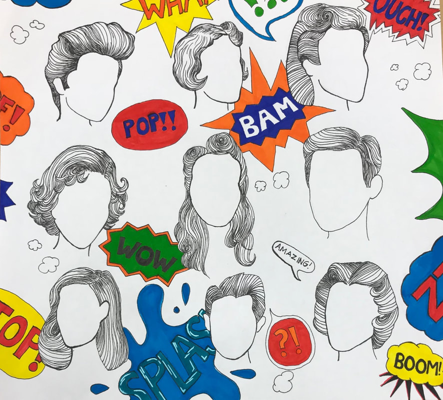 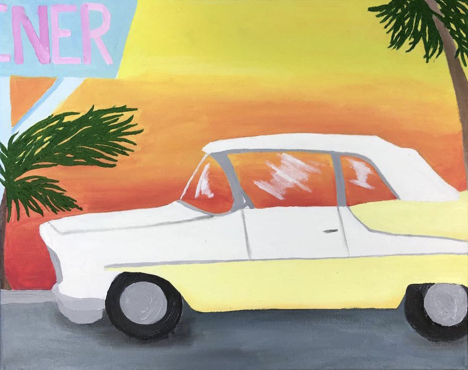 I wanted to include a popular type of car from this time period because it was a well known type, people still are interested in these cars today and collect them, and I love the shape of them. I had fun working on this painting because of the colors. The pale yellow makes the sunset pop and vice versa. I struggled with making the windows look realistic, and I hope to keep trying and learn how to do so. The lighter shadows like on the car was difficult too. I wanted to do a drive in scene, but the idea I had would've taken too long, and I was behind. I took part of my idea and made it into something different.
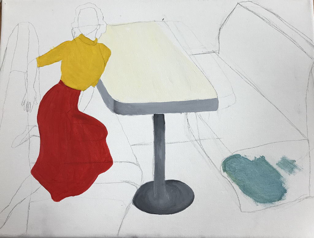 This piece is placed in a diner made to look like from this time era. I combined multiple pictures to come up with this composition, and I think it was worth it. It was difficult to get the right angle and perspective but I think it worked really well. If I could change it I would push the seat on the left back a little, but because of the picture, that’s the way I saw it and drew it. 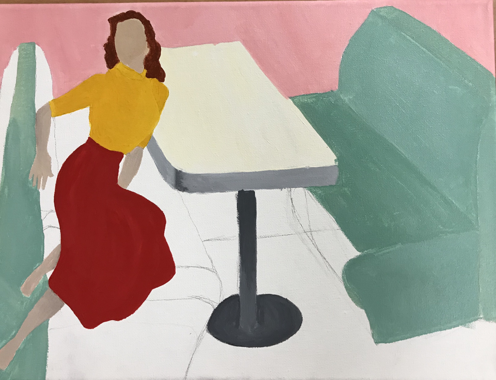 I kept changing parts of this painting as I went because as I work on these projects I realize its better to have something down on canvas instead of trying to perfect just the outline. I can always change it which I think makes me work faster or atleast have more pieces that I’m working on. 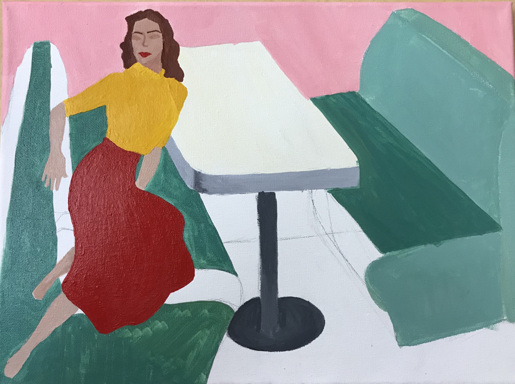 The face was hard for me to get because it's so small, and I'm not used to a size like that. Taking my time and using a small but structured brush really helped. I wanted her lips to pop and match the skirt. The woman was wearing pants but I changed it to a skirt so I could make it red a polka dots. Skirts were more popular in this era, and I think it fit better. I think it works with the yellow, and red lips were super popular back then. I wish I could’ve come up with a better teal color in the first place so I wouldn’t have to keep going over it. 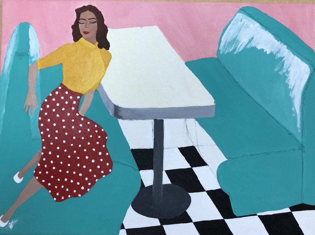 At this point I just need to fix the seats and do the background. I love how the patterns stand out on their own but also work together. I put the white on the seats so when I paint the teal on top it'll stand out and be highlighted. I might have to go back and put more white so its wet and so it'll blend with the teal. I need to keep going darker with the teal for shadows underneath the seats but the base color is just right.
|
AP Slideshowhttps://docs.google.com/presentation/d/1BsKfc5t1K_w3Tdgd1P_6PtwBsPtxMjCXDZFuRFmWSpU/edit#slide=id.p Archives
May 2018
Categories |
 RSS Feed
