|
This semester has been a lot more stressful but also a lot more successful than I thought it would be. I produced more pieces than I thought was possible, and while I wasn't entirely proud of all my works, I was proud of what I managed to accomplish in such a short time. I found what I'm strong at medium and topic wise, and what I can keep working on. This semester has inspired me to keep working on my skills and keep pushing myself to be a better artist. I'm happy I had the resources I did to push me and make me even better. I definitely have some favorite pieces, even from my concentration. As I saw other people's concentration come together I wish I did another topic, but I think I put in all of my creativity and effort into what I was doing. Pushing through a topic that isn't what you wanted to do in the moment is actually rewarding. I came out of my comfort zone and tried painting and drawing new things I might've not done at home. This semester has really made me strengthen my time managment and planning skills.
0 Comments
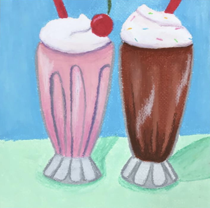 This piece is the other ice cream related one I have, and it supposed to be like there's a couple on a date sharing some shakes. Movies are portraying dates from this era as drive in's and diner dates, and I thought that should be part of my concentration. I used oil pastels and I love using them because of the colors produced. I can get the right colors and blend really well and the creamy texture can allow me to smooth things out unlike prismacolor, which is a different kind of smooth. I'm not as in love with the piece as others, and I wish I planned it better, but I was running out of time.
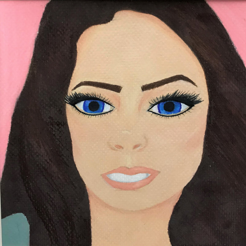 This is a picture of Pricilla Presley, a very popular 50's celebrity. She was influential in hair and makeup trends, and I thought it would be good to do a portrait showing that. Pale lips, big hair, and long dark eyelashes is a classic look, and Pricilla pulled it off effortlessly. I did a close up because I wanted the eyes to be the focus. This one also being in prismacolors made it easier to blend the hair colors together, and add the shadows and highlights to her face. I'm not great at faces, but I want to keep pushing and continue to better myself, and I wanted to show my growth in my concentration. The picture I had was very grainy and it was difficult to get the shadows correctly, but it was a challenge I needed.
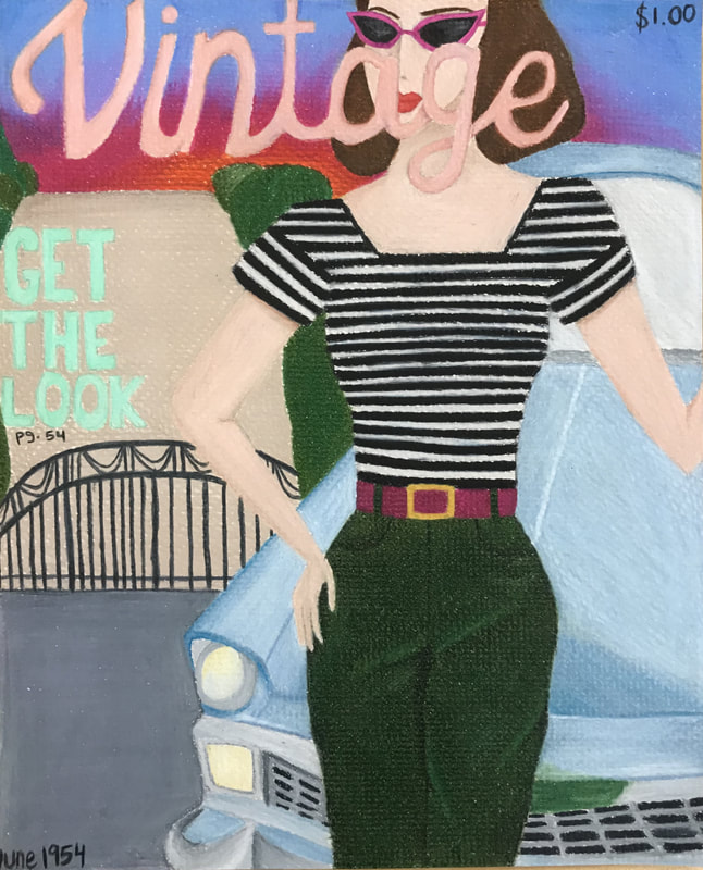 I wanted to do a vintage looking Vogue cover, but since I can't use brand names I just made up a magazine cover name. I wanted to include more cars in my concentration because I really love the vintage style. I wanted to include as many aspects of the 50's lifestyle in my concentration as possible. Since I was running out of time I wanted to use a medium that was quicker but produced something worth looking at. I lightly penciled out the shapes I wanted, then outlines the shapes in each color of the sections. Prismacolor makes it easier to layer and blend colors to make shadows and highlights work, and for the car that was super important, and I'm glad it worked out the way it did.
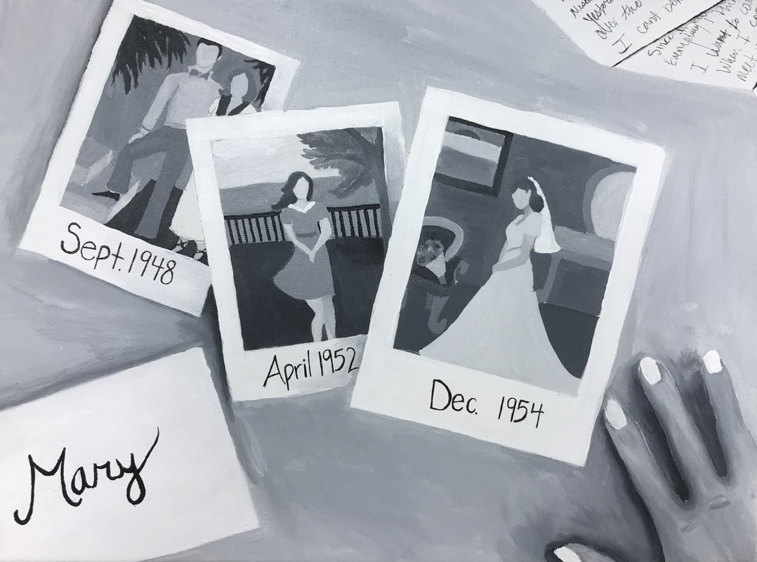 For this piece I took inspiration from old family photos. I wanted to make it look like someone going through old memories and pictures. I remade older pictures into my own and added love letters. These together picture someone sifting through boxes of pictures and letters. It matches my concentration by focusing on the past, and when they were dated. Doing another black and white painting was hard but easier than the first one. Because this one was lighter it was easier to add shadow and be successful.
|
AP Slideshowhttps://docs.google.com/presentation/d/1BsKfc5t1K_w3Tdgd1P_6PtwBsPtxMjCXDZFuRFmWSpU/edit#slide=id.p Archives
May 2018
Categories |
 RSS Feed
