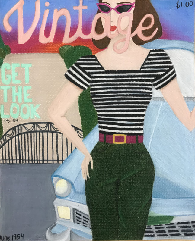
 I wanted to do a vintage looking Vogue cover, but since I can't use brand names I just made up a magazine cover name. I wanted to include more cars in my concentration because I really love the vintage style. I wanted to include as many aspects of the 50's lifestyle in my concentration as possible. Since I was running out of time I wanted to use a medium that was quicker but produced something worth looking at. I lightly penciled out the shapes I wanted, then outlines the shapes in each color of the sections. Prismacolor makes it easier to layer and blend colors to make shadows and highlights work, and for the car that was super important, and I'm glad it worked out the way it did.
0 Comments
Leave a Reply. |
AP Slideshowhttps://docs.google.com/presentation/d/1BsKfc5t1K_w3Tdgd1P_6PtwBsPtxMjCXDZFuRFmWSpU/edit#slide=id.p Archives
May 2018
Categories |
 RSS Feed
